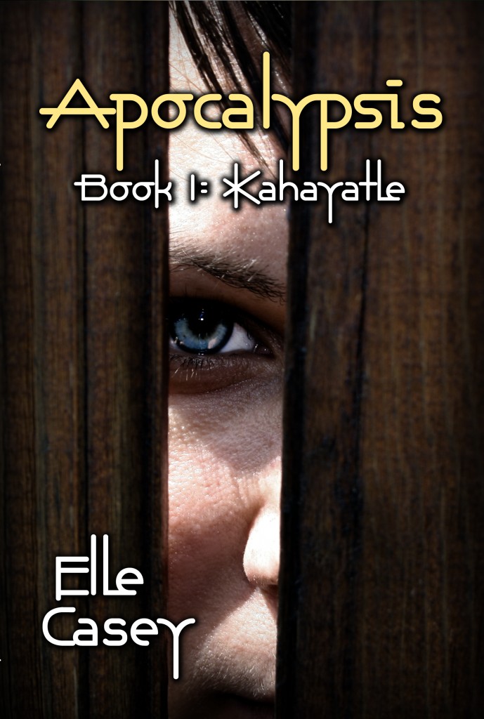
I read several comments over the past six months or so left by readers in reviews about how they skipped over reading Apocalypsis: Book 1 for a long time because the cover creeped them out. Granted, it's pretty striking. But I loved the artwork so much, and felt it was so perfect for the book, that I ignored the complaints. Then sales kind of dropped off, and I thought I might as well give a new cover a shot. I searched stock photo sites for art and came up with this. I think it captures a scene in book 1 pretty well, and the fact that many readers couldn't decide which main character this was, Bryn or Peter, is a good thing as far as I'm concerned. For the record, though, the model is a girl.
Sign up for my FREE newsletter! Click here...


This is a fantastic cover. The other one was good too, but this feels more relevant. This picture sparks curiosity even though I’ve already read the book! I hope the responses to this art are what you hoped for.
Thank you for saying so. I’m glad you like it. I’m torn between the two, so to make myself happy, I’m leaving the paperback with the green cover and the ebook with the brown. Who says you can’t have the best of both worlds, right? 🙂 xoxo Elle